


In part 1, I discussed how I came to own and use an UP3 personal fitness tracker. It wasn’t the life-changing experience I’d hope for, but it did provide me with a year of activity data. In part 2, I’ll explain how to load that data into Qlik Sense visualisation software, then in part 3 I’ll create a series of longitudinal charts.
In addition to this article, you’ll need two other things:
- The Qlik Sense data analysis and visualisation software we’ll be using.
If you already have Qlik Sense, great, you can use that. If not, download and install it onto your PC (Windows only I’m afraid). The software is free (yes, really) and can be used in perpetuity for your own data analysis.
If you are a non-Windows user, or your IT team restrict installation of software, you can do everything we’ll be doing here using the cloud-based version. For that you’ll need to sign-up to the Qlik Cloud. This is also free for personal use, it’s secure and private, and you can choose to share your UP analysis with up to five other users!
- You’ll also need some data. If you have an UP device, feel free to download and use your own data. If not, I’m happy to share my data with you. Make a note of where this data is, as we’ll need to access it later. By default, the location will be your Downloads folder.
Creating a new Qlik Sense app
With access to Qlik Sense (cloud or local), and some data, we can begin.
First let’s open Qlik Sense or login to Qlik Cloud. You’ll be presented with the Qlik Sense Desktop hub.
If you see a welcoming dialog window, click the large “CREATE A NEW APP” button. If you simply see the desktop, click the toolbar “Create new app” button.
You’ll be prompted for a name, let’s use “UP3 Data”. Then click “Create”, and you’ll be informed the new app was successfully created.
Click “Open app”. Next we’ll look at how to read the data.
Loading data into the Qlik Sense app
When the “UP3 Data” app is open, you’ll be presented with a blank page offering two options for adding data:
- Add data
Opens a simple wizard for connecting to many different data sources such as Excel, DB2, MS SQL Server, and Oracle amongst others. The wizard automatically creates a powerful, data loading script for accessing and manipulating data. - Data load editor
Opens the script editor directly and is for more advanced users. Almost every function available in Excel, and other analysis tools, are available here too.
Click the “Add data” option.
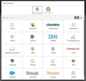
We’re now presented with a list of standard data connectors. For anything not listed here, you could try either ODBC, OLE DB, or REST.
Our UP3 data is stored in a CSV/Excel file, so click the first option, “All files”.
Browse to the location where you stored the UP3 data. This could be your Downloads folder if you’re using my data, otherwise you may have a specific project folder with your own UP data. Highlight the data file then click the (next) right arrow.
The next wizard screen previews the data. It’s now possible to change field names, remove fields entirely, and move the first row starting point to omit multi-row headers. None of these options are relevant for our UP data, so simply click the “Load data and finish” button without making changes.
Qlik Sense now shows that it is loading data, with a timer to show the elapsed time. The more data available, and the more complex the functions applied, the longer the load will take.
Whilst the exact processing time will depend on the specification of your PC, and other processes running at the same time, in most cases the UP data will be loaded in a few seconds.
Checking data relationships and adding further tables
Once the data load has finished, there are three options available. To ensure the data is loaded and in the expected format, and to check any table relationships if multiple tables were loaded, I always check the Data Manager. Click “Open Data manager”.
For our single table of UP data, you’ll see a single “circle” of data. If we linked another table, you would see the relationship graphically. This is also the place to add more data via the wizard. Clicking the “Tables” button, allows more data to be added.
The Data Manager is also the location to refresh the data. If you add more UP data to the source file, it will not be automatically loaded into Qlik Sense without first triggering a refresh. To do this, click “Load data”.
Do this now, and on completion Qlik Sense confirms a successful load.
With only two options now available, click “Edit the sheet” to display the page where charts and analysis will be created.
The analysis page is empty. In part 3 we’ll create a number of longitudinal charts to allow our UP3 app to provide analysis of our performance.
Trackbacks/Pingbacks